Introduction to visual design support |
Design Support for Compact Framework User Controls was a new feature of Visual Studio 2005. It enabled design support for FlexPendant SDK controls to be included in FlexPendant SDK 5.08.
From FlexPendant SDK 5.08 onwards you visually design the FlexPendant application user interface in the Visual Studio Designer. FlexPendant controls are dragged from the toolbox to the designer area, moved and resized by clicking and dragging. By applying different settings in the Properties window of a control, you refine its appearance and behavior.
To use the visual design support you must add the FlexPendant controls to the Visual Studio toolbox. How to do this is detailed in Setting up design support for FlexPendant controls.
 Note Note |
|---|
Design support for FlexPendant controls has long been on FlexPendant SDK users’ wish list. It is indeed a time-saving feature, as most of the code supporting the graphical user interface is now auto generated. |
You may wonder why the standard Microsoft Windows controls have not been considered good enough to be used for the FlexPendant touch screen.
The answer is that some Windows controls may very well be used. Other Windows controls are however not so well suited for the FlexPendant touch screen. To navigate using your finger controls in particular need to be large enough. In some other cases the Windows controls simply do not look very good on the touch screen.
| Note |
|---|
In the Reference Manual FlexPendant SDK, click the Contents tab and the ABB.Robotics.Tps.Windows.Forms node to get an overview and a short description of all ABB controls you may use to create the user interface of a FlexPendant application. |
| Tip |
|---|
| How to program these ABB controls is very similar to the equivalent Windows controls. If you need code examples the best source of information is usuallymsdn. Refer examples to find out how to program a ListView. |
The following screenshot shows the Visual Studio Toolbox with all of the FlexPendant controls to the left. In the Designer area to the right, a FlexPendant application is being developed. Part of the container control, along with a number of ABB and standard Windows controls can be seen.
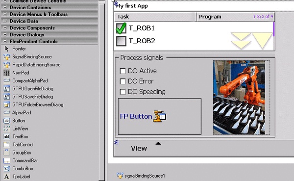
The following features are worth noting:
A Windows PictureBox control is used as the container of a photo.
The FlexPendant button has a property called BackgroundImage, used to display an image. The ABB image library located in the Resources folder, which comes with the installation of FlexPendant SDK, has numerous icons, which can be used by custom applications. You can of course also use photos and icons of your own.
Some of the ABB controls, such as the SignalBindingSource, have no graphical representation in design-time. As you see in the figure, they are placed in the components pane under the main form. Code is generated similar to the controls that you see on the form.
Usually a mix of Windows and ABB controls are used for a FlexPendant SDK application. For example, as there is no ABB RadioButton or CheckBox the equivalent Windows controls are used. In the figure, the standard Windows CheckBox is used.
 Caution Caution |
|---|
Do not forget about the limited amount of memory available for custom applications when adding images or photos! For more information, see Introduction. |
| Caution |
|---|
Auto generated code for controls is located in the method InitializeComponent. You should not tamper with the code inside this method. Any modifications or additions to auto generated code is usually best located in the constructor, after the call to InitializeComponent. |
Are you ready to program and test your first FlexPendant application? If you have not created a FlexPendant project and added the FlexPendant controls to the Visual Studio Toolbox you need to do that first. For more information, see Using the project template in Visual Studio and Setting up design support for FlexPendant controls.
Follow these steps to create and test a simple custom application:
Step | Action | ||
|---|---|---|---|
1 | Drag a FlexPendant button from the Toolbox to the Designer. | ||
2 | Double-click the button in the Designer, this opens the code editor. | ||
3 | As you see an event handler for the click event has been created. Add the code to launch the Hello World message in it: C# private void button1_Click(object sender, EventArgs e) { try { myLabel1.Text = " Hello World! "; } catch(System.Exception ex) { // Catch is mandatory here!! // If there is no catch to take care of an error caused by your application, // not only your application, but the entire FlexPendant, will crash, as all FP applications share the same GUI-thread. // It is up to you how to handle the error. Normally, you may want to display an error message, something like this: GTPUMessageBox.Show(this.Parent , null , "An unexpected error occurred \nError Message: " +ex.Message , "Application Error" , System.Windows.Forms.MessageBoxIcon.Question , System.Windows.Forms.MessageBoxButtons.OK); } finally { // cleanup code goes here (if needed) // "finally" is used to guarantee that cleaning up resources, releasing mastersip etc is not skipped due to the exception. // (In this case, the finally clause is not necessary, as there is nothing to clean up.) } An alternative way of adding an event handler is shown in the next step.
| ||
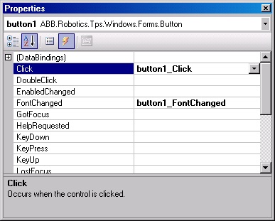
4 | Bring up the Properties window for the button by right clicking it in the Designer and selecting Properties. Click the events button (yellow flashing lightening) to see the events available for the ABB button. As shown by the figure, you have already connected an event handler to the click event.
| ||
5 | On the Build menu, click Build Solution and check that you did not get any compilation errors. | ||
6 | To test the application you need to deploy it to a robot system. If there is no robot system available, you must create a robot system by using the System Builder of RobotStudio. | ||
7 | Copy the assembly (*.dll) and the proxy assembly (*.gtpu.dll) from the bin\Debug (or bin\Release) directory of your Visual Studio project to the HOME directory created by RobotStudio when your robot system was created. Example showing default paths for copy/paste:! If you have already started the virtual FlexPendant you need to close it before pasting the dlls. C:\Data\Visual Studio 2005\Projects\TpsViewMyApp\TpsViewMyApp\bin\Debug\ C:\Systems\sys1_508\HOME
| ||
8 | Start the virtual FlexPendant. | ||
9 | On the ABB menu, find your application and open it. | ||
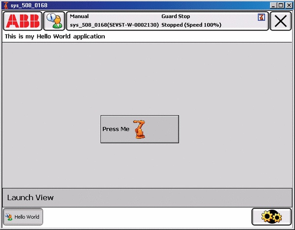
10 | Click the button. The Hello World message will be displayed.
|
| Tip | ||
|---|---|---|
When using the Virtual FlexPendant for test and debug you can automate the copy/paste procedure described in the preceding step seven. The following procedure explains it: Procedure title
|
This section details how to program the remaining features of the Hello World application shown in preceding step nine: application title, button background image, command bar with a menu item. You will also learn how to implement an event handler for the Lanuch View command.
When you create a FlexPendant project you choose Empty or Form in the FlexPendant SDK Project Wizard. For more information to understand the difference between them, see ProjectEmptyEmpty or Form?. In our example Form is selected as the container control.
Step | Action | ||
|---|---|---|---|
1 | If you selected Empty for your project you can change it to Form by exchanging TpsControl with TpsForm directly in the source code, like this: C# public class TpsViewIRC5App14 : TpsForm, ITpsViewSetup, ITpsViewActivation VB Public Class TpsViewIRC5App14 Inherits TpsForm '(was TpsControl before) Implements ITpsViewSetup, ITpsViewActivation
| ||
2 | Right-click somewhere in the middle of the container control and select Properties . | ||
3 | Enter “This is my Hello World application” at the Text property. See the tip of ProjectEmptyEmpty or Form? if the Text property is not available. | ||
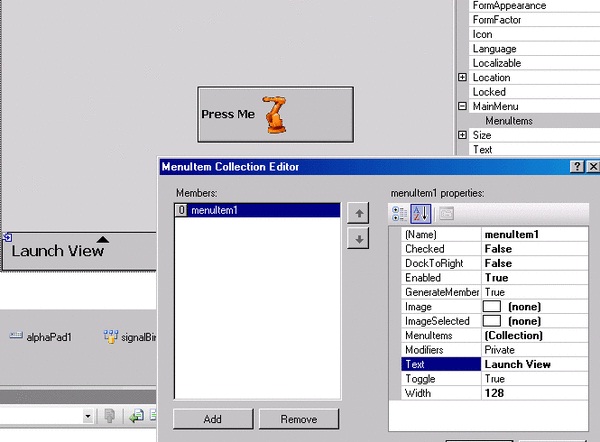
4 | Still using the TpsForm Properties window, expand the MainMenu property node. | ||
5 | Click the MenuItems property and the browse button which appears once the property is selected. | ||
6 | In the MenuItem Collection Editor, which is now launched, click the Add button. Then enter “Launch View” at the Text property. Click OK.
| ||
7 | Add an event handler with code that will launch the standard Jogging view when the Launch View button is pressed. Adding event handlers is done differently in Visual Studio depending on which programming language you are using. For C# In the constructor, after the call to InitializeComponent, add a subscription to the click event of the “Launch View” command. Write: menuItem1.Click += then TAB twice. As you will notice, Visual Studio intellisense auto generates an event handler, and you only need to write the code for launching the Jogging view: this._launchService.LaunchView(FpStandardView.Jogging,null,false,out this._cookieJog) Add an event handler using the preceding drop down boxes the Visual Studio Code Viewer. Find and select MenuItem1 in the left drop down box and the Click event in the right drop down box. The event handler is now auto generated for you, and the only thing you need to do is to write the code for launching the Jogging view (see VB code in Launching standard views).
| ||
8 | Declare the _launchService and the _cookieJog objects: private ABB.Robotics.Tps.Taf.ITpsViewLaunchServices _launchService;private object | ||
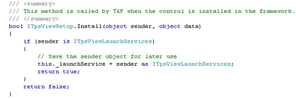
9 | Retrieve the _launchService object in the Install method of your class:
For VB code example, see Installing ITpsViewSetup. | ||
10 | In the designer, open the Properties window of the button. | ||
11 | Enter “Press Me” at the Text property. | ||
12 | Select the BackgroundImage property and browse to the Resources folder of the FlexPendant SDK installation and import “IRB140.gif”.
| ||
13 | Build, deploy and start the application, that is repeat step five to eight in Hands on - Hello World . | ||
14 | Click the Launch View command. The Jogging view should open up and get focus. |
| Tip |
|---|
| For more information about the possibilities to use already existing views for your application, see Using launch service and Using standard dialog box to modify data. |
There is another definition of the term Visual design, which is not in the scope of this manual. It has to do with how the design of the software user interface affects user experience. This is nonetheless an important topic for a FlexPendant application developer. Knowing what makes a user interface intuitive and easy to use is essential, as this is exactly what is expected from a custom operator interface.
| Tip |
|---|
A FlexPendant style guide comes with the installation of FlexPendant SDK. It will help you to present application functionality in an intuitive way, teaching best practices of visual design and user experience from the FlexPendant perspective. It is a preliminary draft, but still very useful. You may also want to study the Microsoft standard for visual design. |