ListView |
The ABB.Robotics.Tps.Windows.Forms.ListView is very similar to a standard .Net ListView. The main difference is that its appearance is somewhat adapted to the use of a touch screen, as can be seen in the figure.
You can use the ListView control in a variety of ways. Usually you use it to display a list of items with item text and, optionally, an icon to identify the type of item. By using the CheckBoxes property it is also possible to have a check box appear next to each item in the control, allowing users to check the items they want to perform an action on.
IllustrationThe figure shows the Designer. You see two different ABB ListView lists, a standard .Net ImageList in the components pane under the lists and the Properties window for the Calibration, HotEdit list.
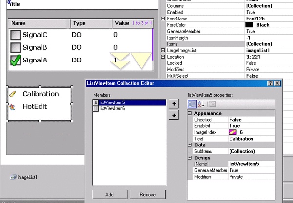
The first list has CheckBoxes set to true. To have columns displayed View must be set to Details. The columns are created by selecting Columns and adding any number of columns in the ColumnHeader Collection Editor. Scrollable has been set to true to enable you to scroll the list to see all items. To have the current number of list items displayed ShowNumberOfItems has been set to true. By using Sorting the list items can be alphabetically sorted, in this case in Descending order. The list is statically populated, using the Items property.
The View property of the other list is set to LargeIcon instead of Details. To display icons a standard .Net ImageList is used. You first launch the Properties window for the ImageList and add the images you want to use. At the LargeImageList property of the ListView you select the image list, and for each Item you select the ImageIndex to use, as is shown in the ListViewItem Collection Editor.
Using the Properties window you can also add event handling. The most commonly used event is SelectedIndexChanged, which is triggered when a new list item is selected.
The Properties window can be used to statically populate the list. Usually, however, lists are populated dynamically. In Getting signals using Signal Filter there is a code example, which shows how I/O signals are dynamically displayed in an ABB ListView .
ABB specific propertiesThese properties are specific for the ABB ListView:
Property | Usage | ||
|---|---|---|---|
MultiSelect | Specifies whether multiple items in the control can be selected. The default is false. | ||
Scrollable | Specifies whether a scroll bar is added to the control when there is not enough room to display all items. The default is true.
| ||
SelectionEnabledOverScrollbuttons | Specifies whether a touch inside the scroll region should select an item or scroll the list. The default is false. | ||
ShowNumberOfItems | Specifies whether the current number of items in the list is displayed. The default is true. Scroll bars should be added to the control to allow you to see all the items. If the list is not scrollable the default value is false. | ||
ShowSelection | Specifies whether selection is shown or not. The default is false. |
 Note
Note