Button, TextBox and ComboBox |
The FlexPendant button, text box and combo box controls are not very different from the equivalent Windows controls.
Using ButtonA common size of a FlexPendant Button is 120 * 45 pixels; it can be a lot smaller than its default size. As opposed to a Windows button it can display an image. As pointed out in TabControl Illustration you use the property BackgroundImage and browse for the image to be displayed.
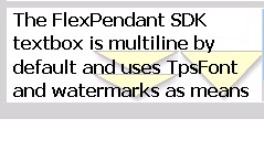
Using TextBoxThe TextBox control is multiline by default and uses the typical FlexPendant scroll bars as shown in the following figure.
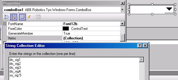
The ComboBox is very similar to theSystem.Windows.Forms.ComboBox , but is visually improved to suit the FlexPendant touch screen. It can be statically populated using the Items property as illustrated by the figure. If you wish to populate it dynamically, you need to write code for it.
SelectedIndexChanged is the most commonly used among the events. It occurs when you select another item from the list.